
Words by Farrah, pronouns: She/her | Images by Suzy Lafosse
Welcome to Sky Sirens! We’re known for our warmly inclusive community, for proudly embracing the erotic roots of our dance styles, and of course, for being an incredibly Instagrammable space! So let me take you on a little tour of each of our unique and highly curated studio rooms.
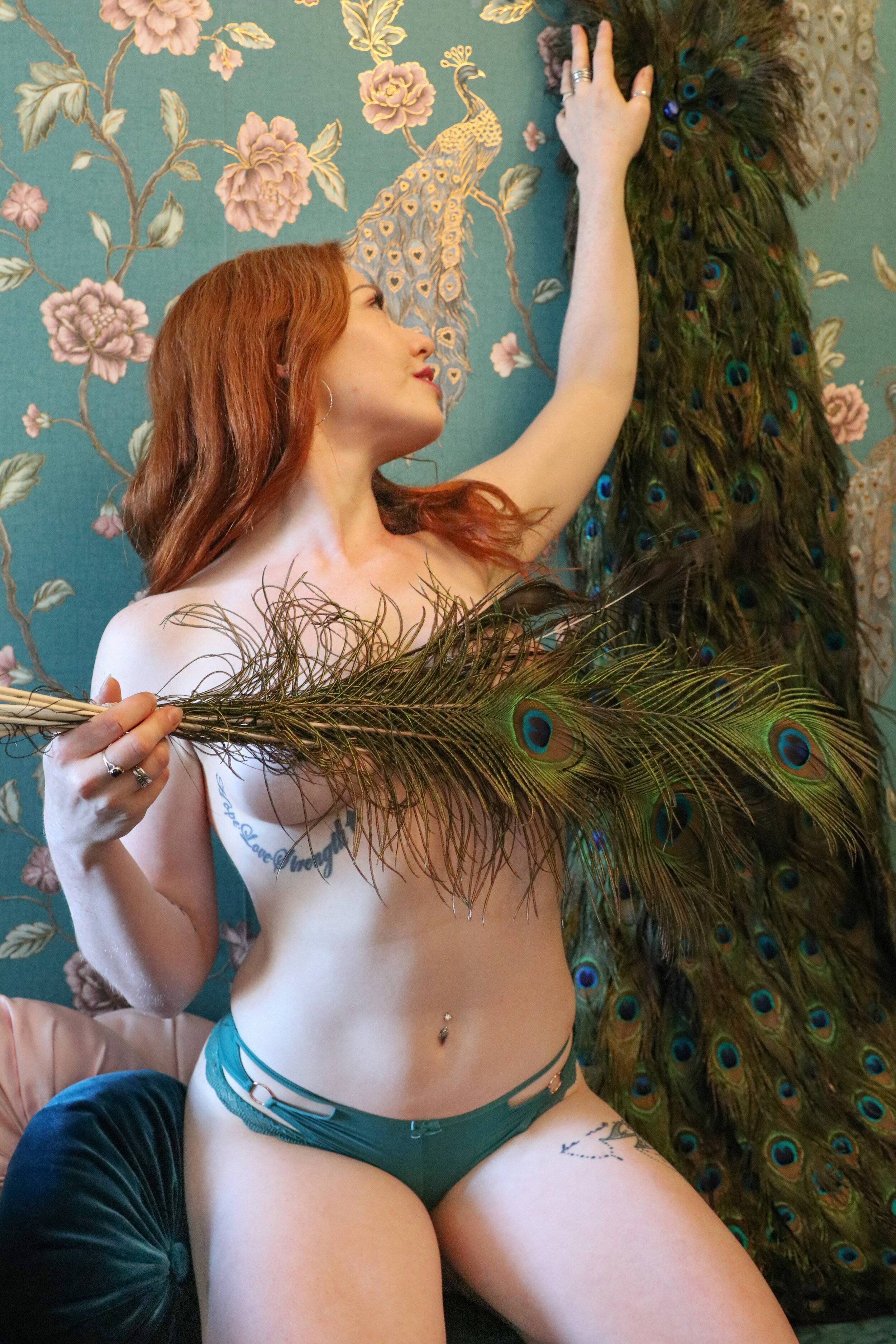
Before we start exploring the classrooms, let’s head upstairs and take a moment in the calming, deep blue-green of our peacock-themed changing room…
Featuring peacock feathers, a stunning peacock dress, and of course richly embossed wallpaper proudly festooned with peacocks, our upstairs changing room is an oasis of opulence set against a rich teal backdrop. But despite our obvious obsession with peacocks, the word “teal” actually comes from a different bird altogether – a teal! It’s a type of duck whose head sports a bright blue-green stripe, who knew?!
Our beautiful changing area takes after another famous “Peacock Room”; a nineteenth century dining room which was originally designed for the upper-class London home of Frederick Richards Leyland, then later transported to America and reassembled in its entirety in Washington DC, where it remains on display to this day.
The original designer of the room – Thomas Jeckyll - fell ill partway through and the project was taken over by celebrity artist Whistler, who was left alone in the home while the works were completed. Whistler was given permission to make some minor tweaks to the preliminary design, but he got a bit carried away and saturated every wall and wainscot of the room in decadent teal paint embellished with costly gold leaf! Whistler transformed a room that had originally been intended to display a collection of beautiful Chinese porcelain into a sumptuous and striking space that blatantly overshadowed the treasures it had initially been intended to highlight.
Unfortunately, Leyland had neither requested nor could he afford this incredibly expensive design, so he and Whistler fought bitterly over payment. It is said that Jeckyll fainted upon seeing the room and never recovered, eventually being branded “insane” and passing away a few years later in an asylum.
Whistler meanwhile took his revenge on the homeowner by returning to the property without Leyland’s permission and finishing off the room with an enormous mural of two peacocks fighting. The work was titled Art and Money; or, The Story of the Room and the duelling peacocks represented the artist and the homeowner at war. If you look closely at the peacock avatar of Leyland, he is literally made of money, with gold and silver coins making up his plumage and scattered across the ground around his clawed feet! It was Whistler’s final jab at the man who he saw as an ungrateful cheapskate who had stifled a genius’s creativity.
Fortunately for lovers of interior design, Leyland never painted over the masterpiece nor remodelled the room at all, and it survives today. And thankfully the cool tones and soft cushions of the Peacock Room in our studio incite far fewer feelings of spite and parsimony than its namesake!

Let’s move down the hall now and enter the Leopard Luxe pole room, with its beautiful expanse of leopard print wallpaper reflected in the mirrors and picking up the warm, brassy tones of our poles.
Everyone nowadays considers leopard print a neutral, right? It’s been considered both a “do” and a “don’t” by the fashion world for many decades - but whether you think it’s tasteful or trashy, leopard print is certainly here to stay!
Leopard print made its high fashion debut in 1947 on Christian Dior’s runway for the “New Look” collection, consciously designed to be extravagant, glamorous, and thoroughly feminine. Amid feminist protests against the cinched waists and long skirts showcased in the collection, and perhaps in a nod to the widespread use of leopard print in luxury Art Deco furnishings, Coco Chanel cattily remarked of the collection, “Dior doesn’t dress women, he upholsters them!”
It’s worth remembering that leopard print also has a long history outside of the Western world, notably in Africa. There it continues to be used as an eye-catching status symbol by people as diverse as the leaders of the Judeo-Christian Shembe church in South Africa, and the Congolese dictator Mobutu Sese Seko. For Canadian-Haitian fashion photographer Émilie Régnier, who has spent time living in Gabon, Senegal, and Paris, this dichotomy provided the opportunity to explore a dialogue between African and European couture in her 2017 solo show From Mobutu to Beyonce, which examined the impact of African fashion and beauty on Western styles.
The Western association of leopard print with female sexuality began with Vanity Fair in 1953, which first marketed leopard print lingerie, and it was already being flaunted just a few years later when iconic pin up Bettie Page wore a skimpy, handmade leopard print outfit in the famous Jungle Bettie photographic series. Régnier asserts that leopard print so quickly took on this sexual subtext in the West “because it was linked to Africa.” She continues, “If a woman was wearing leopard, it means that she has a savage or wild sexuality. It became one of the most used prints in haute couture, and from haute couture it became democratized to streetwear.”
Jo Weldon - burlesque dancer, author, and activist – laid out her reasoning for why women are so often drawn to leopard print as an empowering print in her book Fierce: The History of Leopard Print; “Leopards are independent, they’re adaptable, they’re in every environment […] They sleep in trees, they can swim in the water, they’re born to single moms. They’re these very powerful, independent, beautiful animals.”
So the question remains, is leopard print tasteful or trashy? In the past it was worn by fashion icons and It Girls like Jackie Kennedy Onassis, Edie Sedgwick, Diane von Furstenberg, and Linda Evangelista to invoke a sense of moneyed luxury and high-class lifestyle. But by the 1970s and ‘80s, punk icons like Debbie Harry and Poison Ivy of The Cramps lampooned this elitism and radically reinterpreted the sexuality of the print. The subversion was taken even further when male punks, notably Iggy Pop and Sid Vicious, began wearing what had previously been seen as an ultra-feminine motif. In the ‘90s, leopard print was embraced as a tongue-in-cheek signifier of social climbing by celebrities who had come from lower socio-economic backgrounds, such as Fran Drescher and Lil Kim.
Today leopard print remains strongly represented at all levels of income and aesthetic, from haute couture runways to cheap fast fashion clothing racks. And especially at Sky Sirens!

Red carpets, red bottomed shoes, red wine, red lipstick, red light district… Red is such a ubiquitously glamorous and sexual colour! In light of that connection, our gorgeous pole room wouldn’t be complete without its two deep red walls, one upholstered in plush red velvet.
Red is one of the oldest colours know to have been used decoratively; there are prehistoric rock and cave paintings all over the world created by Palaeolithic early humans using red ochre to depict their world. To different people in different times and places, the colour red has symbolised many opposing concepts. It stands for both royalty and revolution; sacred rites and the devil; romantic love and frenzied sexuality; the vitality of life as well as spilt blood. As a redhead myself – in a studio seemingly full of redheads! - I’ve always appreciated the breadth of meanings embodied by the colour red.
According to the tenets of colour therapy, a bright red wall can evoke powerful feelings of invigoration, passion, and high energy. Red colours used in interior design have even been shown in some studies to attract attention, boost metabolism, increase respiration and heart rate, and even raise blood pressure. How fitting then to see it in our Leopard Luxe pole room, where so many Siren babes spend hours passionately fighting to conquer that nemesis move and seductively slinking across the floor!
We even have shades of red hiding in unexpected places throughout the studio, such as the crimson wallpaper in our gender neutral bathroom, the bright scarlet of the new feather fans and tulle boas being enjoyed by our burlesque students, and the deep burgundy of some of the lingerie for sale in the Parlour.
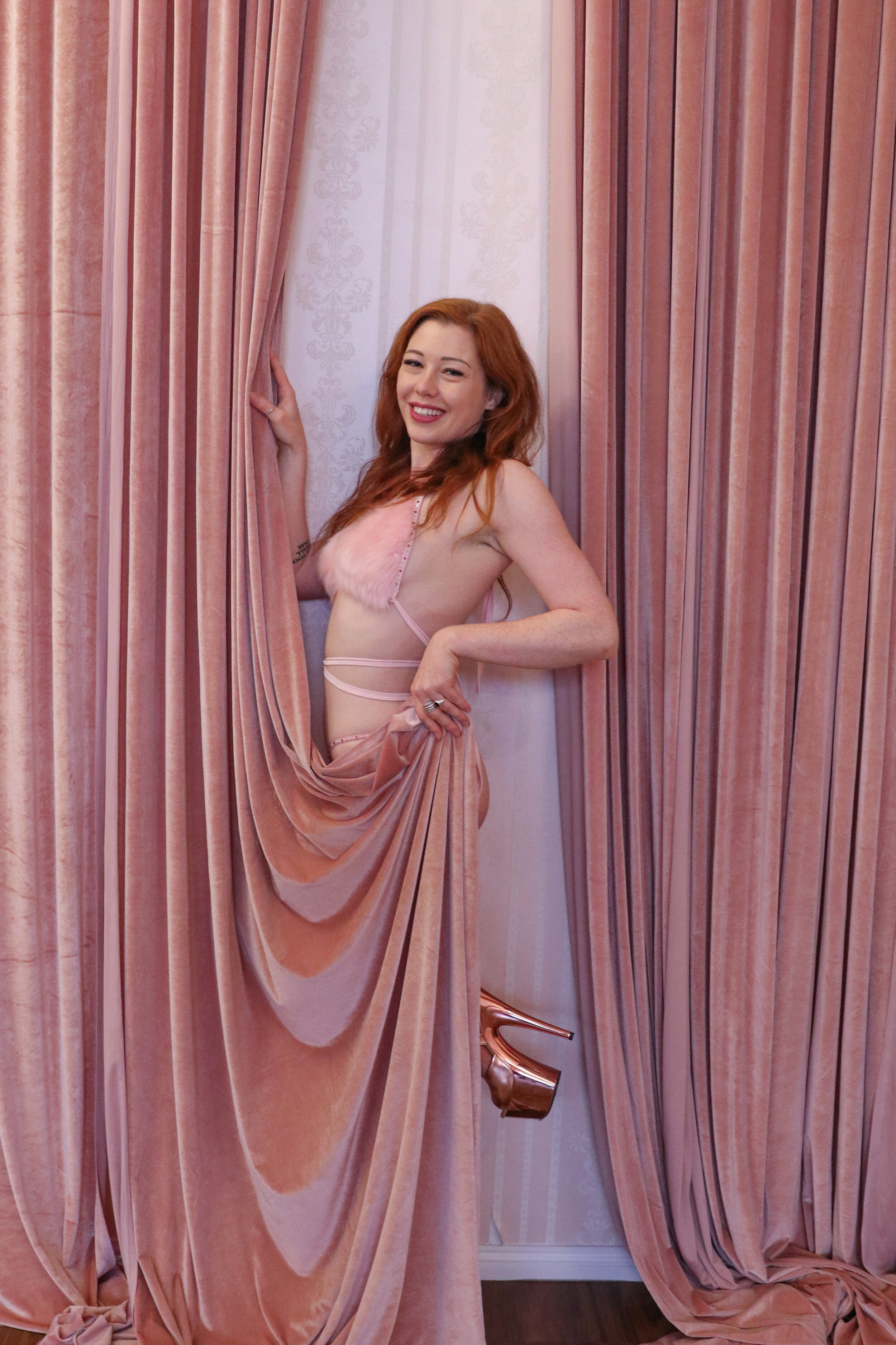
It’s time to move downstairs to the lyra room. Follow me to our beloved Dollhouse, with its dreamy colour palette of soft baby pinks and rose golds.
From the millennial pink tones of our Parlour with its rose gold wallpaper and blush pink chaise lounge, to the baby pink pillow walls of the endlessly Instagrammable hot pink Flamingo Fantasy room, there’s no denying that Sky Sirens is a studio saturated in pink! And for good reason; pink is the colour most often associated in our modern minds with soft sensuality, as well as both femininity and queerness. With its recent revival in popularity thanks to the rise of rose gold and so-called “millennial pink”, let’s take a moment to appreciate the history of this often divisive but always eye-catching colour.
We usually categorise pink as being a “girly” colour, but that hasn’t always been so! Japanese samurai culture associated pink with masculinity, and it was the colour of mourning for young warriors who were slain in the prime of their lives. And in 19th century Europe, pink was in fact the popular colour choice for dressing young boys! This is because red was associated with the military, so it stood to reason that male children would be dressed in a gentler shade of what was seen as the most masculine colour. Light blue meanwhile was seen as delicate, and therefore more suitable for a dainty little girl to wear.
Pink only began its association with femininity around the 1950s, when synthetic dyes became more cheaply available and the opportunity to experiment with bolder shades of pink arose. Think of Marilyn Monroe’s fabulous fuchsia gown in 1953’s Gentlemen Prefer Blondes, or Jackie Kennedy’s infamous pink Chanel suit and matching pillbox hat worn on the day her husband was assassinated in 1962.
Pink is also associated with the LGBTQIA* movement, and the original Rainbow Flag designed in 1978 featured a hot pink stripe representing sex. A pink or magenta stripe also features in the Bisexual Pride flag, the Pansexual Pride flag, the Transgender Pride flag, and in a number of different Lesbian Pride flags.
Prior to that, pink became symbolically linked with homosexuality after the Nazi occupation of Europe. Queer people were deported to the concentration camps where they were labelled with inverted pink triangles to mark them out from other prisoners. The pink triangle has since been reclaimed as a symbol of pride and remembrance, and notably was used as the symbol of ACT UP (the AIDS Coalition to Unleash Power) in the 1980s.
Lately, pink has also become the colour of feminist protest, a recent example being the hot pink “pussy hats” of the 2017 anti-Trump Women’s March protests, as well as the magenta saris of anti-rape movement the Gulabi Gang in India. At a time of worldwide outcry against systemic misogyny and patriarchal society as a whole, the universal resurgence of pink’s popularity directly challenges the gender bias embedded in the idea that things which are marketed specifically towards girls and women are inherently lesser.
This rehabilitation of pink in a post-gender world has been led by the rise of so-called “millennial pink”, a dusky, almost earthy shade of blush. But two years before that term was even coined, in November 2014, The Colour Marketing Group predicted that Shim – described as “a deep pink-beige” – would be an emerging colour trend by 2016. The shade was even tipped to signal a shift in gender politics, and as such the name Shim was formed as a contraction of “she” and “him”.
The prediction was cemented when the Pantone Colour Institute named Rose Quartz one of their joint “Colours of the Year” in November 2015 (alongside a soft periwinkle blue named Serenity). In September 2015, the first rose gold iPhone was released and became a huge hit. One year later, in September 2016, the Pantone Colour Institute doubled down, namechecking Pale Dogwood - another pale, earthy take on blush - in its spring 2017 fashion report.
Leatrice Eiseman from Pantone praises millennial pink as a “nuanced neutral,” and even in 2021, its continuing popularity is showcased in every conceivable interpretation, from fashion runways to home interiors, nail art, book covers, and even lighting filters being used in fashion photoshoots.
Pink might not be for everyone, but one thing is for certain, it’s here to stay. And at Sky Sirens, we couldn’t be more tickled pink!

The last room we’ll be visiting is the studio’s smallest room - but its small size doesn’t mean it missed out on getting the full Sky Sirens treatment! The Golden Glamour room – home to burlesque troupes and conditioning classes – is our love letter to the timeless elegance of the Art Deco style. Filled with feather boas and adorned with glistening gold-patterned wallpaper, this room simply glows with warmth and luxury!
There’s no denying that gold is the precious metal most strongly associated with decadence and décor. Wars have been waged over it, love stories have been sealed with it, and entire lifetimes have been devoted to trying to re-create it from scratch. There is evidence that humans have been mining and using gold to create decorative items since around 4000 BC! In fact, due to the soft, malleable nature of the mineral it was used almost exclusively to make jewellery and sacred totems for many thousands of years.
It was around 1500 BC in ancient Egypt when gold was first minted into currency, and it has been used ever since to create coins of varying values across the world. Gold rushes have shaped the history of nations as geographically separate as Australia, the United States, and South Africa, and in the modern world what was once coveted purely for ornamental purposes has found new applications in technology, further reinforcing the importance of this precious metal to humankind.
Art Deco embraced the glister and glamour of gold from its very outset. The style first developed in the 1920s in France as an extravagant reaction against the austerity necessitated by World War One, which had recently ended. But Art Deco fashions, furniture, architecture, and artwork quickly became popular worldwide, and what is now loosely referred to as the Art Deco era spanned from around 1925 until the 1940s. As a historical period, it is almost inextricable from the indulgent excess of the Roaring Twenties and the daring innovations of the Jazz Age, although it encompasses a longer time frame than those two periods generally refer to.
The elegant, glamorous, sophisticated, and opulent aesthetic of Art Deco combined with the thoughtful functionality of the era’s design pieces means that a revival of this perennial style is never far away. Characterised by angular geometric patterns, metallic finishes (especially gold!), decadent detailing, luxurious materials, and lacquered wood, the styling of the Art Deco movement suits the Sky Sirens aesthetic down to a tee and made it an obvious choice for our burlesque room!
Dancing in the Art Deco era was a big deal, with jazz music and swing dancing both reaching the zeniths of their popularity. Many new dance styles were innovated, including the energetic Charleston and the partner-swinging Lindy Hop, both of which became wildly popular and contributed to the development of swing dance as a style.
It also coincided with the heyday of burlesque, which by the 1920s had evolved from more comedic vaudeville-type routines into what we would recognise today as striptease. Prominent and influential performers of this era include the infamous Gypsy Rose Lee; the legendary Josephine Baker, who was a pioneering erotic dancer of colour as well as a member of the French Resistance during World War Two and an American civil rights activist!; Sally Rand, who popularised fan dancing; and Gladys Bentley, a proudly out and queer drag king of colour.
The spirit of Art Deco truly brings together the innovators of early burlesque, the glitz and glamour of luxurious furnishings, the decadence of the Roaring Twenties, and the high energy of jazz music! We couldn’t ask for a more perfect match for our burly babes here at Sky Sirens.